My First AI Lifestyle Photo Test for a Shopify Product
I used to treat a lifestyle photo as the thing you make after the product page is already finished. That was backwards. A good lifestyle image is useful because it answers a shopper's quiet question: where does this belong in my life? But it only works when the product still looks like the product.
My first test with an AI product-photo tool is deliberately small: one SKU, one source image, one use case. It gives me something I can judge without turning a twenty-product catalog into a visual experiment.
Supra AI Photo Studio is built for that sort of workflow inside Shopify: it can isolate a product, improve the source image, place it in a new environment, and create on-model or video variations. I would not begin by asking it to remake my catalog. I would use it to earn one new image slot.
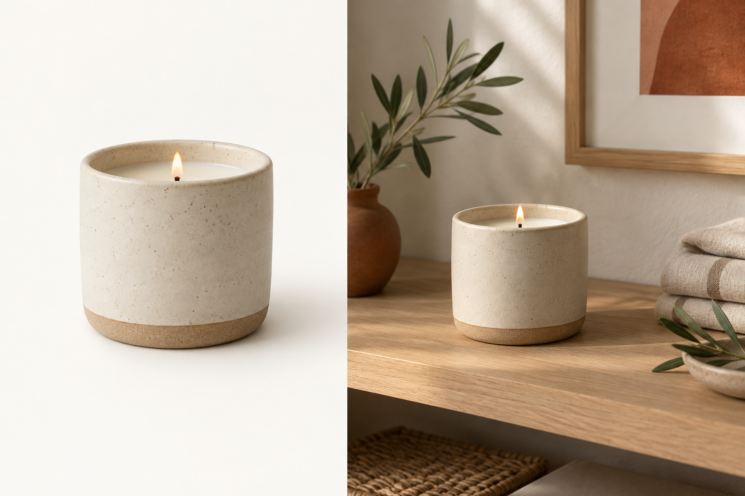
Pick a product with a real context problem
The easiest first candidate is not necessarily your bestseller. It is the item whose current image is technically fine but does not explain its use: a candle on a plain background, a water bottle with no sense of scale, a throw pillow with no room around it, or a skincare product with no routine attached to it.
I avoid the SKU that already has complex styling, lots of variants, or an open return-quality issue. The point is to test whether added context helps, not to create a new production problem. Before I generate anything, I write one sentence: This image should help a shopper imagine this product in this moment.
For fashion and accessories, I also make sure the original image is clean enough for a try-on workflow. This earlier guide on preparing a Shopify product photo before creating an AI lifestyle scene covers the same non-negotiables: clear edges, accurate color, and no busy background competing with the item.
Start with a source image you would trust on its own
AI cannot rescue uncertainty about the actual product. My source-photo check is short:
- The product is sharp at the size shoppers will see.
- Its important material, color, and silhouette are visible.
- There is enough clean edge around it to separate it from the background.
- I know which detail must not change: label placement, hardware, fabric texture, finish, or shape.
If the source is soft, badly lit, or cluttered, I clean it up first. Supra AI Photo Studio includes background removal, upscaling, and lighting enhancement; those are useful prep steps, not the finished creative strategy. The finished image still needs to make a credible promise about what arrives in the box.
Give the scene one job
My best prompts are more like merchandising notes than mood boards. Instead of “make this luxurious,” I specify the setting, surface, light, and shopper moment: “place this ceramic candle on a pale oak nightstand, morning light, restrained linen, product at realistic scale.”
That gives me a result I can reject or approve. It also prevents the common failure mode where the background is attractive but the product looks pasted into somebody else's editorial.
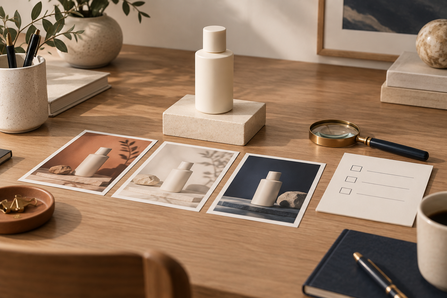
For the first run, I create only three directions:
- A safe version that resembles the store's current visual language.
- A practical-use version that shows the product in context.
- A more editorial version for an ad or campaign test.
The winner is rarely the most dramatic scene. I choose the one that makes the product easier to understand in two seconds.
Review the generated image like a catalog editor
I review at full size, then at the smaller crop that will actually appear on the product page. I look for four things:
- Product fidelity: would a customer recognize the exact item?
- Scale: does it feel physically believable next to surfaces and props?
- Light: does the product share the scene's direction and intensity of light?
- Merchandising: is the eye still drawn to the product first?
If any answer is no, I revise the prompt or discard the result. I do not “fix it later” by placing an off-brand image halfway down a page. Product information has to remain scannable alongside the imagery, which is why I pair these tests with a clean content structure—like the one in my guide to organizing Shopify product information with tabs and accordions.
Publish one image, then compare behavior
I add the approved lifestyle image as a supporting image, not a replacement for the clear packshot. The product page still needs its straightforward “what is it?” photo. The lifestyle image gets the “why would I want it here?” job.
Then I watch the signals I can actually act on: image-gallery engagement, add-to-cart behavior, conversion by product, and customer questions. I do not claim a win from a prettier grid alone. If shoppers still ask about dimensions, materials, or fit, the answer may be better product-page structure, a sharper size chart, or a close-up detail image—not another generated scene. My fit-family audit for Shopify size charts is the same kind of discipline applied to sizing: validate the decision aid before scaling it.
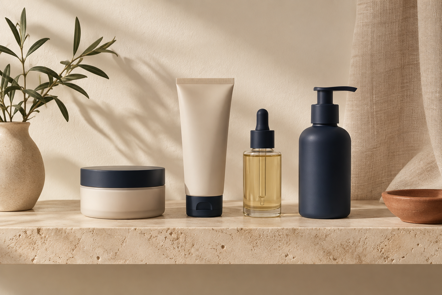
Build consistency only after the first test earns it
Once one image works, I save the ingredients that made it credible: source angle, camera distance, lighting description, prop limits, and what I rejected. That is how a one-off experiment becomes a repeatable image brief. It is also how I avoid a product grid that looks like four different brands hired four different photographers.
For products where shape and scale do the selling, I would also consider whether an interactive asset is more useful than another lifestyle photo. The 15-minute 3D capture readiness test is a sensible check before committing to that path.
My next action is simple: choose one product whose plain photo hides its real use, prepare the cleanest source you have, and make three scene directions in Supra AI Photo Studio. Keep the strongest image only if it makes the product clearer—not merely prettier.