How To Add Color Swatches In Shopify Without Code
If your products come in multiple colors, size options, or finishes, adding clickable color swatches is one of the fastest ways to increase product discovery, reduce returns, and improve conversion. The best part? You don’t need to touch your theme code.
In this guide, you’ll learn exactly how to add beautiful, fast-loading color swatches in Shopify without code using Supra Swatch Colors—an easy, highly customizable app that works with any theme and supports both product variants and separate product pages.
What you’ll need
- A Shopify store with products that include color options or separate color listings
- The Supra Swatch Colors app: https://apps.shopify.com/swatch-colors-ultimator
Why color swatches matter for ecommerce UX
- Faster choices: Shoppers can see available colors at a glance without opening extra images or pages.
- Fewer surprises: Clear visual options reduce returns caused by color confusion.
- Better browsing: Swatches on collection pages encourage exploration and boost click-through.
- Consistent branding: On-brand shapes, sizes, and tooltips make your store feel polished.
The fastest no-code method: Supra Swatch Colors
Supra Swatch Colors makes it simple to add color and image swatches to product and collection pages—no theme edits required, compatible with all themes, and fully multilingual.
Supra Swatch Colors makes it simple to add color and image swatches to product and collection pages—no theme edits required, compatible with all themes, and fully multilingual.
Key advantages over typical alternatives:
- Highly customizable with 20+ swatch styles (shape, size, borders, tooltips, labels, checkmarks, and more)
- Works with variant options or by linking separate products into one swatch group
- Built-in collection page swatches (no code), instant-loading for a smooth UX
- Multilingual support and auto-detection of store colors for fast setup
Try it free today on the Shopify App Store: https://apps.shopify.com/swatch-colors-ultimator
Step-by-step: Add Shopify color swatches without code
- Install the app
- Go to https://apps.shopify.com/swatch-colors-ultimator and click Add app.
- Approve permissions and open the app in your admin.
- Choose how you’ll power your swatches
You have two no-code paths:
- Variant-based swatches: Use your existing product variant option (e.g., Color) and convert it into clickable swatches.
- Linked-product swatches: If you list each color as a separate product, link them into a single swatch group so shoppers can switch colors without leaving the page.

- Turn your variant option into swatches (no code)
- Select the Color (or your chosen) option and enable swatches.
- Choose whether to auto-detect color names (e.g., “Red”, “Navy”, “Olive”) or pull from product images.
- Preview your changes directly on your product page.
- Link separate products with swatches (no code)
- Create a product group in the app and add each color’s product to the group.
- Set the swatch display to color chips or thumbnail images.
- Result: One unified product view with quick-switch color swatches—even though each color remains a separate product page.
Pro tip: Use descriptive product titles and consistent color naming (e.g., “Forest Green” vs. “Green”) for clearer tooltips and SEO-friendly labels.
- Show swatches on collection pages
- In the app, turn on Collection page integration. Swatches will appear beneath each product card automatically.
- Choose how many swatches to show before a “+ more” indicator to keep grids tidy.

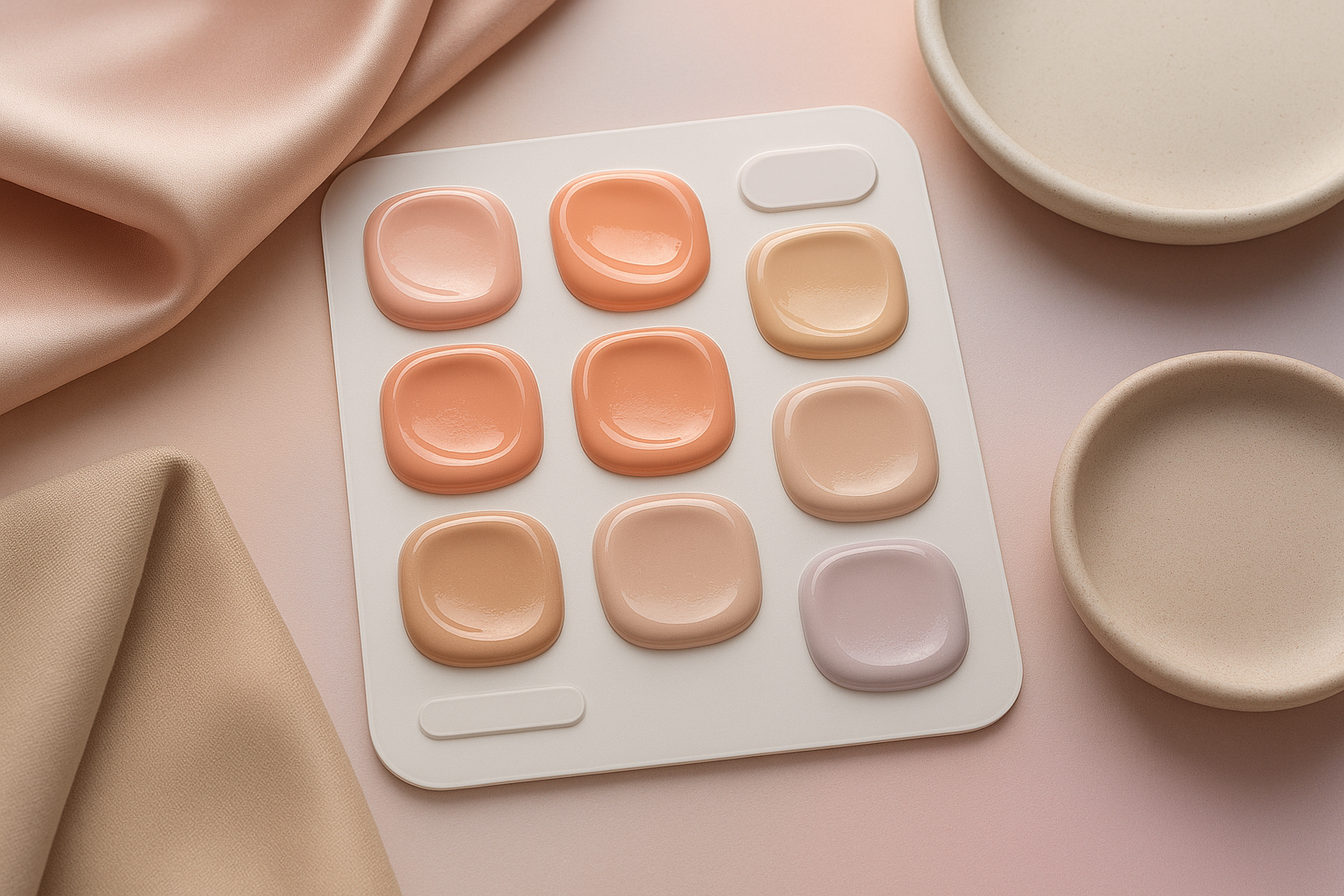
- Match your brand with 20+ styles
From minimalist circles to elegant rounded squares, you can fine-tune every detail:
- Shape & size: Circles, squares, or rounded squares with exact pixel sizes
- Borders & states: Hover, active, focus rings; show a checkmark when selected
- Tooltips & labels: Customize fonts, colors, and text for accessibility
- Image-based swatches: Use small fabric, finish, or pattern thumbnails for accuracy
- Sold-out & unavailable states: Cross out or dim swatches to set expectations

Multilingual shops, performance, and theme compatibility
- Multilingual ready: Translate labels and tooltips so the same swatch UI feels native in every language your store supports.
- Theme-agnostic: Works with all modern themes, no manual code edits needed.
- Instant-loading: Lightweight rendering for snappy interactions and a frictionless experience.
Video quick-start guides
- Overview: Supra Swatch Colors — Shopify App to add Color Swatches to Products https://www.youtube.com/watch?v=k8uyugxH9To
- Getting started: Supra Swatch Colors — Tutorial https://www.youtube.com/watch?v=K_2l9G1ibIo
- Link separate products via swatches: How to Link Shopify Products with Color Swatches https://www.youtube.com/watch?v=H9LOX-vOjYI
- Collection page swatches: How to add Swatches on the Collection pages of your Shopify Store https://www.youtube.com/watch?v=FKZQpBrAJQQ
Best practices for high-converting swatches
- Keep names consistent: “Navy” vs. “Dark Blue” can confuse; pick one and standardize.
- Use texture images for tricky finishes: Wood grains, metallics, and fabrics benefit from image swatches.
- Limit visual clutter: Cap the number of visible swatches on collection grids, use “+ more” when needed.
- Prioritize accessibility: Ensure tooltips and labels are readable; provide clear selected states.
- Mind SEO: Descriptive color names and alt-text-friendly labels can improve long-tail discovery.
Troubleshooting tips (no code)
- Swatches not showing? Confirm the option name matches exactly (e.g., “Color” vs. “Colours”) or that your product group is active.
- Theme cache: After major style changes, refresh or clear your theme preview cache to see updates.
- Mixed product setups: If some items use variants and others use separate products, you can mix both methods—just configure per product.
Why choose Supra Swatch Colors
Many swatch tools require manual theme edits, don’t support collection pages, or lack deep customization. Supra Swatch Colors offers:
Many swatch tools require manual theme edits, don’t support collection pages, or lack deep customization. Supra Swatch Colors offers:
- No-code setup across product and collection pages
- 20+ styles and granular controls for a perfect brand match
- Variant and linked-product support in one app
- Instant-loading interactions and multilingual support
- Scales to thousands of swatches and product groups
Get started now
- Install on the Shopify App Store: https://apps.shopify.com/swatch-colors-ultimator
- Learn more on the product site: https://supra-swatch-colors.sktch.io/
With a few clicks, you’ll have on-brand, lightning-fast color swatches that delight shoppers and streamline product discovery—no code required.