How I Refresh Shopify Size Charts for a New Apparel Collection
I used to treat a new collection’s size chart as the last tiny task before publishing products. Then I learned the expensive version of that lesson: new fabric, a revised fit, or a different supplier can make last season’s chart actively misleading. The product page may look complete, but the shopper is still guessing.
Now I make size-chart maintenance part of collection setup, alongside imagery, copy, and inventory checks. It takes less time than repairing product descriptions one by one after launch, and it gives customers a clear route to a confident choice.
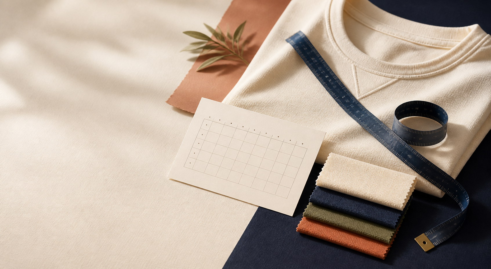
Start with the fit change, not the old table
Before I copy a chart, I ask a blunt question: is this actually the same garment shape? A new colourway in the same cut may share a chart. A new knit gauge, wash process, rise, sleeve construction, or supplier usually deserves a fresh check.
I put every incoming SKU into one of three buckets:
- Same fit: the pattern and grading are unchanged, so the existing chart can be reused.
- Related fit: it shares a category but differs enough to need its own chart or a fit note.
- New fit: it needs a dedicated chart and, usually, a measurement guide.
That classification stops the familiar shortcut of calling every relaxed tee “the same” just because it is a tee. It also makes it much easier to decide where a collection-level assignment is safe. If you need the mechanics of assigning charts by collection, product type, vendor, or tag, I recommend this guide on setting up Shopify size charts that update across your catalog.
Check the measurements against a real sample
A chart should describe the garment a shopper will receive, not a supplier spreadsheet you inherited three seasons ago. I measure one approved sample flat and compare it with the proposed values before publishing. For a top, that normally means chest width, body length, shoulder width, and sleeve length. For trousers, it may mean waist, hip, inseam, rise, and leg opening.
The point is consistency. Choose a method, name it clearly, and keep it stable across comparable products. If the chart lists a half-chest measurement, do not quietly switch the next collection to circumference. A small note such as “measured flat; double for full chest” can prevent a surprising amount of confusion.
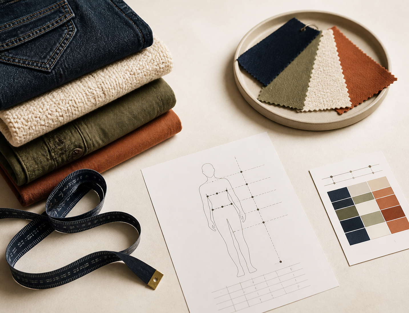
Numbers alone are not enough when shoppers do not know where the tape measure belongs. I pair charts with a simple visual guide and labels that match the table. The practical walkthrough in How to Build Size Charts Shoppers Can Measure at Home is a useful reminder: clear measurement instructions are part of the product information, not decoration.
Build a clean chart family instead of cloning product descriptions
This is where I stopped using product descriptions as a database. Repeated HTML tables are hard to spot-check, awkward to update, and easy to leave behind on one forgotten SKU. I use Supra Size Chart to create the chart centrally, add column units and fit notes, and then attach the appropriate measurement guide. The app stores charts as Shopify metaobjects and supports CSV or JSON import and export, so the information stays portable with the store.
For a typical collection, I create one chart family for genuinely shared fits, then make exceptions explicit. For example, a heavyweight overshirt may sit in the same collection as tees but should not inherit the tee chart simply because its product type says “tops.” The rule should express a merchandising decision, not hide it.
My review checklist is short:
- Does each size label match the actual variants customers can select?
- Are metric and imperial values sensible for the markets we serve?
- Does the measurement guide use the same terms as the table?
- Does a product with a distinct fit have an exception instead of an inherited chart?
- Is there a fallback chart only where a fallback truly helps?
Roll out with rules, then test on real product pages
Once the chart family is ready, I assign it with the narrowest rule that fits the collection. Collection rules are great for a clean capsule with one fit. Tags are handy when a related fit appears across several collections. Product-level rules are the right answer for a hero SKU with its own proportions. Specific rules should beat broad ones; otherwise the catalog becomes impossible to reason about later.

I then open a few actual product pages: one standard SKU, one intentional exception, and one newly added product that should inherit the rule. I test the chosen display mode in the live theme, too. An inline table is usually best when sizing is central to the purchase decision; an accordion keeps a dense product page quieter; a modal makes sense when the guide needs more space. The goal is not to show every feature. It is to make the right information easy to find before a shopper adds two sizes to the cart.
Treat this as part of the same final merchandising pass as images and product copy. My Shopify product photo QA workflow catches visual inconsistencies; this pass catches the sizing information that turns those visuals into an informed purchase.
Keep the launch checklist small and repeatable
The operational win is not a more elaborate chart. It is making chart review routine enough that it happens every time the assortment changes. I keep a reusable checklist: identify fit families, measure an approved sample, update the central chart, attach the right guide, assign rules, and spot-check the storefront. For a fuller pre-launch version, see the apparel size guide launch checklist I use before a Shopify drop.
If your store still has sizing tables scattered through product descriptions, start with the next collection rather than trying to repair the whole catalog in one afternoon. Create the first shared chart in Supra Size Chart, assign it to the products that genuinely share a fit, and test it on three live pages. That is enough to replace a fragile habit with a system you can keep improving.