How I Chose a Shopify Swatch App for Variants, Linked Products, and Collections
I kept running into the same Shopify problem: the product page looked fine until a shopper had to choose a color. Then the experience fell apart into dropdowns, separate product pages, or a theme-specific fix that never quite carried over to collection browsing.
What I wanted was simpler. I wanted one swatch system that could do three jobs at once: show variant colors as actual swatches, link separate products where that made more sense, and keep collection pages visual instead of hiding everything behind text labels.
Supra Swatch Colors was the app that matched that requirement set. It supports color and image swatches, product groupings, linked products, collection pages, multilingual shops, and more than 20 styles. It also says it can auto-detect colors from the store or use product images to speed up setup.

The part I cared about most
I was not looking for a clever swatch trick. I was looking for consistency.
The non-negotiables were:
- no theme code just to make swatches appear
- product pages and collection pages using the same logic
- linked products and variants both fitting into one system
- enough styling control to match the brand instead of fighting it
- something that would still make sense on a multilingual store
That is why I liked the app's 20+ styles and the controls around tooltip, label, size, and shape. If swatches are going to replace a dropdown, they have to feel like part of the storefront, not a plugin pasted on top.
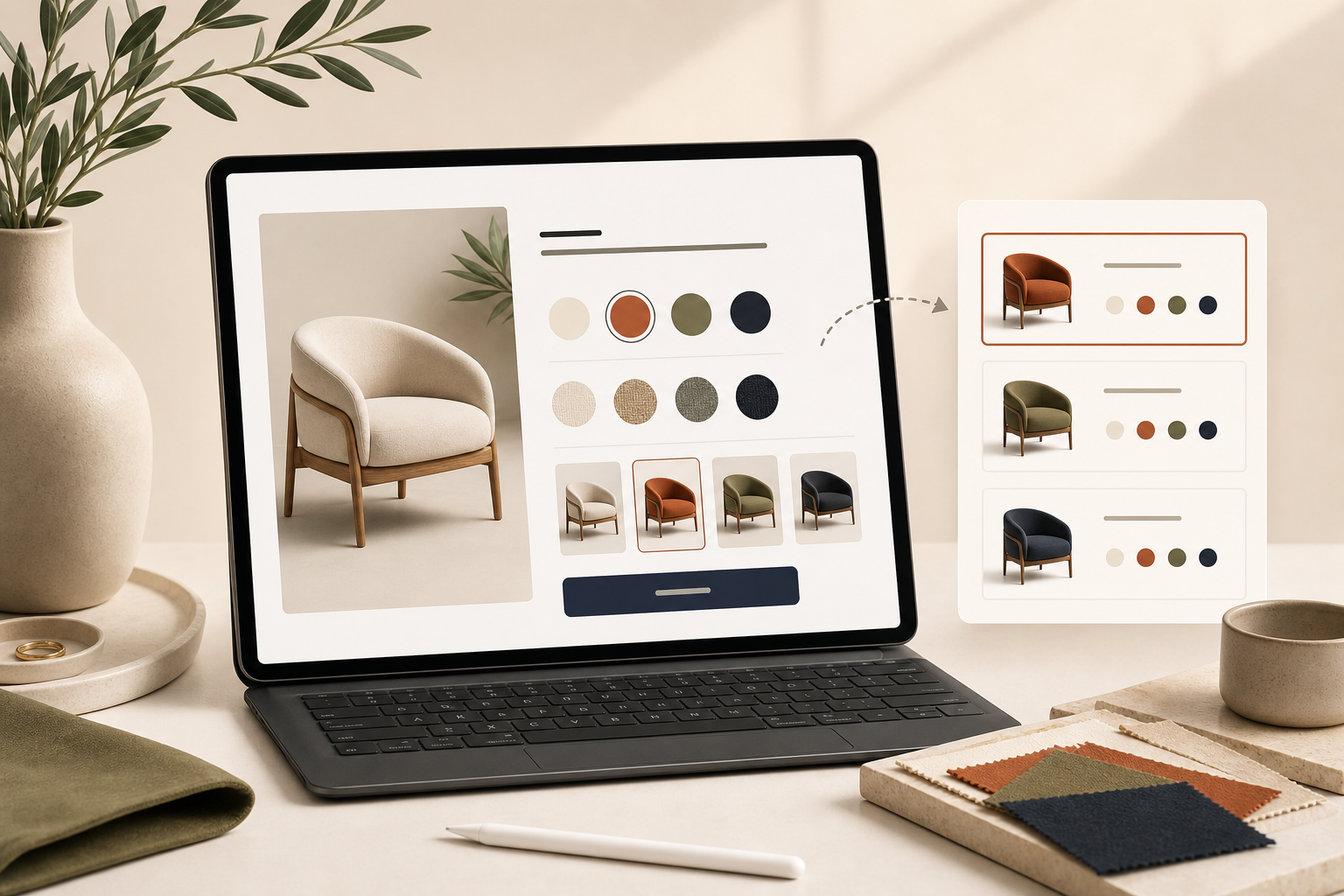
Variants and linked products are not the same problem
This is where a lot of swatch setups get messy.
Sometimes a color is just a variant. Sometimes it is really a separate product page that should still behave like part of the same family. If you treat those two cases the same way, you usually end up with a store that is technically functional but hard to browse.
That is the setup problem I kept thinking about in How to Set Up Shopify Swatches for Variants, Linked Products, and Collections and How I Keep Shopify Swatches Consistent Across Themes and Collections. The details matter because the shopper does not care how the catalog is structured in the admin. They care whether the choice is obvious.
If your product photography is weak, the swatches only solve half of the problem. I tend to pair this kind of work with How I Turn Weak Shopify Product Photos Into Studio-Grade Listings, because a swatch system is only as good as the product images behind it.
Collection pages are where this becomes obvious
The biggest difference for me was collection pages.
On a product page, you can sometimes get away with extra explanation. In a collection grid, you do not get that luxury. If the first thing a shopper sees is a wall of nearly identical items, swatches become a navigation tool, not a design flourish.

That is the part I would not skip. Collection-page swatches make the store easier to scan, and they make product families easier to compare without forcing people to click into every item. That also makes the catalog feel more deliberate when you are dealing with lots of related SKUs.
I think this matters even more when you are deciding which products deserve richer visual treatment. If a line has strong color differentiation, I would consider that before I decide which Shopify products should get 3D models first. Swatches and 3D are solving adjacent problems: one helps people browse, the other helps them inspect.

How I would roll it out
If I were setting this up in a real store, I would do it in this order:
- Pick one product family where color is a real decision, not a minor detail.
- Decide which choices are variants and which are better as linked products.
- Start with product pages first, then turn on collection-page swatches.
- Match the swatch style to the brand and keep tooltip and sizing simple.
- Check the result on mobile before I touch the rest of the catalog.
- Use the auto-detect or product-image setup to avoid manual work where possible.
That sequence keeps the scope small enough that you can tell whether the swatches are actually helping. It also makes it easier to notice if one collection needs a different treatment from the rest.
The thing I would not do is overbuild a custom swatch system just to avoid making a choice. The point is not to get clever. The point is to make product families easier to browse and easier to trust.
If you want the practical starting point, I would use the Shopify App Store listing for Supra Swatch Colors and keep the first rollout small. The product site at supra-swatch-colors.sktch.io is the overview if you want to sanity-check the feature set before you install it. Once the first collection looks right, the rest of the rollout is mostly repetition.