How I Choose Shopify Tab Labels Shoppers Can Actually Scan
I used to treat product-page tabs as a tidy-up tool: take a long description, cut it into pieces, and call it organized. That was only half the job. The part that still made the page hard to use was the tab label. If a shopper cannot predict what is behind
Details, Info, or More, the interface is only hiding the same confusion behind smaller buttons.For a Shopify store with real product information—specs, care, ingredients, compatibility, shipping, and returns—I now start with labels shoppers already look for. It makes the page easier to scan, and it keeps the product description from turning into a wall of copy.

Start With The Question Behind The Click
Good labels answer a shopper question before they click. They are nouns with a clear job, not internal content categories. A practical starting set looks like this:
- Materials & Care for fabric, ingredients, cleaning, and care instructions.
- Size & Fit for measurements, sizing guidance, or compatibility dimensions.
- Specifications for technical attributes, what is included, and product facts.
- Shipping & Returns for delivery expectations and return policy details.
- Compatibility when an item only works with certain devices, products, or systems.
That list is not a template to force onto every product. A candle does not need Compatibility. A charging accessory probably does. The label should follow the decision a shopper must make before buying. If I am unsure, I read recent support questions and look at the phrases customers use. Their language is usually better than my tidy internal taxonomy.
This is the same reason I stopped writing one giant description and started building a reusable Shopify content system. The product description is still valuable; it just should not be forced to carry every policy and every spec by itself.
Avoid Labels That Make Shoppers Guess
I would retire these labels first:
InfoandDetails: they could mean anything.FAQ: useful only when the content is genuinely question-and-answer.Good to know: friendly, but weak when someone needs a measurement or care instruction.More: acceptable as an overflow control, not as the name of an important content section.
A quick test: could a shopper choose the right section without opening every tab? If not, rename it.
Wash Instructions is less elegant than Care, but it is often the better choice for a customer standing in front of a washing machine.The same principle applies to variant-heavy products. If color is part of the purchase decision, do not bury it in prose. I have found that clear labels work best alongside a deliberate swatch setup; this Shopify swatch checklist is a useful companion for deciding which color information belongs on the product page itself.
Keep The First Screen Focused
Tabs should reduce a decision, not create a new navigation project. On most product pages I aim for three to five visible labels before anything needs to scroll, wrap, or move into an overflow control. My rough order is:
- Put the purchase-critical information first: Size & Fit, Compatibility, or Specifications.
- Follow with confidence-building information: Materials & Care, Shipping & Returns, Warranty.
- Move lower-priority detail into a secondary placement only if it is truly secondary.
If every tab feels essential, the issue is usually not the layout. It is that I have not grouped the content decisively enough.
Care, Materials, and Sustainability might deserve three sections for an apparel brand with substantial information; for a simple accessory, one well-written Materials & Care section may be easier to scan.
Let The Layout Adapt To The Product Column
Desktop tabs and mobile accordions are not competing choices. They solve the same organization problem under different space constraints. A row of tabs works when the product-page column is wide enough to keep labels readable. On a narrow column, stacked accordions keep tap targets comfortable and avoid the tiny, clipped label problem.
That is why I like Supra Tabs & Accordions for this particular job. It lets me build a tab set once, use tabs on desktop and accordions on mobile, then add one theme app block to the product template. It responds to the actual product-page column, which matters when a theme has unusual sidebars or a narrow product layout. The app is free—no trial, tiers, or card requirement—and it changes the presentation of existing Shopify content rather than replacing it.
It also keeps headed content available for search engines and screen readers, which is important: organized does not need to mean hidden. Keyboard support, direct links to a particular tab, and reduced-motion handling are the sort of details I want in a product-page component before I roll it across a catalog.
Build One Set, Then Allow For Real Catalog Differences
The operational win is not creating tabs for one hero product. It is creating a pattern that still works when the next fifty products have slightly different information. I use a reusable set with a mix of shared and product-specific sources:
- A shared store page for shipping or returns.
- A product metafield for individual specifications or ingredients.
- A metaobject field for repeatable structured information.
- The product description for the story and context unique to that item.
Supra Tabs & Accordions can target that set by collection, tag, vendor, product type, or selected products. Empty sections hide when a product has no matching content, so I do not need placeholder copy just to preserve a layout. The preview, match count, and overlap warnings are helpful before broadening a rule across a collection.
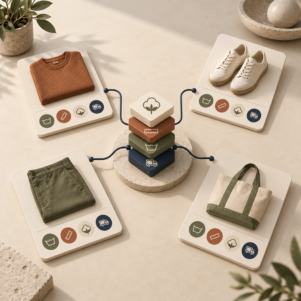
This is especially helpful for information customers compare closely. Apparel stores can make
Size & Fit easy to find and pair it with a proper size chart checklist. Technical catalogs can separate Compatibility from Specifications instead of making customers hunt through paragraphs. And if a seasonal campaign changes prices, the product page stays clearer when the pricing operation itself is handled cleanly; this guide to scheduling Shopify price changes safely covers that adjacent workflow.A Five-Minute Label Review Before You Publish
Before I apply a tab set to a collection, I run this short review:
- Can a new shopper tell what is in each section from the label alone?
- Is the first tab the information most likely to block a purchase?
- Are related details grouped together without making one section too broad?
- Does the mobile accordion order still make sense from top to bottom?
- Does each label match the words customers use in reviews, support messages, and on-site search?
If the answer is no, I fix the label before I add more styling. Better typography cannot rescue
More Info.The Next Fix I Would Make
Open one high-traffic product page and list every question a serious shopper must answer before checkout. Turn the obvious groups into direct labels, then keep the set small enough to scan. If you want to apply that structure without repeatedly editing theme code or product descriptions, install Supra Tabs & Accordions and test the set on one collection first.
A product page does not need less information. It needs information that customers can find at the moment they need it.